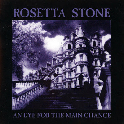
OK, gang, here's the last for 2012...
Among so many others, Leonard Cohen used it in 1974,
Bob Dylan used it in 1979,
The Clash in 1980,
Bauhaus used it for just one release in 1983,
Tones on Tail used it too for almost all their releases,
Rosetta Stone used it shamelessly!
But we all know it and became associated with goth due to the heavy and succesful use it found in the hands of the Sisters and Merciful Release label. Since then all true Goths (sic!) make a connection upon its sight.
Caslon Antique was designed by Bernie Nadal in 1894 as a tribute to prominent type founder William Caslon who designed fonts around the1720s.
Mr. Caslon was a gunsmith who used to engrave gun locks and barrels and was incouraged to create a type foundry in London in which he designed, now famous, for their legibility, fonts.
The most famous print using his font is of course the "United States Declaration of Independence" in 1776 (part of it!)
Nadal designed Caslon Antique to emulate the look observed on prints when consecutive printing, chipped and damaged metal type in the 18th century American print houses.


No comments:
Post a Comment