Search This Blog

Sunday, January 29, 2012

Zig Zag magazine poll ca.1984

Enjoy this clipping from a mid-1984 issue of the then, famous semi-underground magazine, ZIG-ZAG.
Mick Mercer user to write a lot of articles for it...
Interesting categories, no? My fav is "Best dressed single"!!!


Sheer joy!


Tuesday, January 24, 2012

Gothic bands and art vol.2 (Rosetta Stone)

In 1852 a british painter and illustrator, heavily influenced by the Pre-Raphaelite Brotherhood, created "Ophelia" (one of many paintings of that era with this very subject).
His name is Arthur Hughes and his art was noted by radiant coloring and exquisite draughtmanship  on images of romantic love, passion and human fate .
This odd shaped painting was used by Rosetta Stone (a fantastic british band) to illustrate the cover of their excellent 1991 track "An eye for the main chance" on 12" and CD maxi single (Expression Records).
Here's the painting and bellow the cover in question.
Note the slightly smaller cropping on the semicircle and the greenish alteration of colors
on the sleeve...
Great song, Nice choice of image...


Tuesday, January 17, 2012

SOM gig review 1983

This is a press review that appeared shortly after London's gig at the Venue (3-3-1983).
I' m not sure though if it was on the Melody Maker or the NME...
If someone knows please feel free to complete the info...
By the way, I love this exuberant writing style by this certain miss Elissa Van Poznak...
Enjoy!


Thursday, January 12, 2012

80s goth bands logos pt.VI (The Rose of Avalanche)

OK the Roses were up to a point an interesting band. They've released very good tracks. 
I don't think their intension was ever to copy the Sisters but some songs reflect that a lot.
A thing the Sisters brought up was to have a logo that was supposed to represent their own label but was used so heavily that it got transformed into the band's own symbol. 
In the Roses case we have -according to their bio that can be found here: (http://www.roseofavalanche.com/biog3.htm)- the opposite. 
The bands logo turned into their own and only label's symbol.
What's odd is that even in their early 12" on different labels, that rose thing appeared on the left upper corner of the back sleeve with the single word "Avalantic" beneath.


So it was used on almost all their  releases even before their "Avalantic" label logo days that started in late 1988. I couldn't find it on their "In Rock" LP sleeve as this was released without the band's permission in 1987 by Fire records. Also on an earlier release of "First Avalanche" LP by italian label Contempo in 1985. I recommend this band to those who still ignore them.


Stay tuned for more...

Wednesday, January 4, 2012

"Bela Lugosi's dead" 12" backside image origin


In 1920 Robert Wiene released the movie "Das cabinet des Dr. Caligari".
It's a silent horror movie that belongs to the German Expressionistic film era.
It's mood is very intense and it's no wonder arty aesthetes as Bauhaus where influenced by it - definitely a must see. 
In the climax of the plot the zombie-like Cesare, assistant to the evil Dr. Caligari kidnapps the beautiful Jane - girlfriend of Francis (the hero) - and a hunt of course, follows...
This is the still from the hunt scene


and just as he goes down the bridge


this is the poster


and this is the use Bauhaus did in the backcover of their first release “Bela Lugosi’s dead".


It perfectly suits the mood!
Well done. 

Check wikipedia if you need some more info on the movie.

Friday, December 30, 2011

Postcards (Part 1)


Hi,
I've got a collection of postcards and here are some 2bles I wish to exchange with other postcards or badges of similar '80s bands. 
They were bought in the '80s and are in mint condition.
Size 15 x10 cm approx.


Backside details: PC 12 SISTERS OF MERCY
PRINTED IN ENGLAND
"CULT IMAGES" 


Background black color is brownish

Backside details: Editions OASISPrinted in E.E.C.

Backside details: Editions Musicartes
Printed in E.E.C.
EM 486 SISTERS OF MERCY


Backside details: Editions OASIS
Printed in E.E.C.


If you wish to exhange leave a comment
I'll post the whole of my collection in parts...

Monday, December 19, 2011

Gustave Doré and the Goths (Sex Gang Children)

Paul Gustave Doré (1832 – 1883) was a french artist with a gift for engraving. He made a career as an illustrator for books such as the Bible, Milton's "Paradise lLost", Dante's "Divine Comedy", Edgar A.Poe's "The Raven" e.a. He worked primarily with wood and steel engraving. The images he created are classic and timeless full of mood, tension and an uncomparable romantic approach. 
It's no wonder goth bands of the 1980's used his imagery on their record sleeves. The Sisters of Mercy are the most notable example but today it's Sex Gang Children's turn.
On their first 7" single cover "Into the Abyss" in 1982 the band used a Doré illustration from his work for Dante Alighieri's "Divine Comedy" c. 1861-68.


The original illustration is entitled "Alichino and Calcabrina" after the names of two demons fighting over a lake in hell. Dante and Virgil are overlooking...
I'm telling you, if you like goth and moody dark imagery, Doré is your man...


Friday, December 16, 2011

Press material and gig ads 2


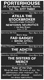
I'll start regularly posting clippings concerning gig ads and other material, from music papers of the '80s (NME, the Sounds, Melody Maker, Zig Zag e.a). It's quite interesting to see who played where and with whom before they became "big names".

OK, as promised, here's part 2. 
Stay tuned as there are many to come...


Friday, December 9, 2011

80's goth bands logos pt.V (Red Lorry Yellow Lorry)

While I'm scanning gig ads for the previous post, here's something else...
The Lorries were a great band and like Gary Marx, quite underrated! ;-)


They used this logo for almost four (4) years, that is from 1982 till approximatively, 1986.
The two (2) trucks appeared on the sleeve of "Beating my head" 7"single (in color as 
you can see).
The last time they used it on a record label, sleeve or other, was if my memory serves me  
well, for "The very best of" in 2000. But by 1986 it was abandoned from regular releases.


A great band, a not so great symbol...
Let alone the resemblance to the mighty Jamie Reid's "nowhere buses" for 
the Sex Pistols in 1976.


Tuesday, December 6, 2011

Press material and gig ads

I'll start regularly posting clippings concerning gig ads and other material, from music papers of the '80s (NME, the Sounds, Melody Maker, Zig Zag e.a). It's quite interesting to see who played where and with whom before they became "big names".
Enjoy!


1983: 


I'll soon upload more clippings...

Saturday, December 3, 2011

Gary Marx is underrated!

Ok, I don't know how many of you knew this, but I just recently heard these excellent tracks and got aware of the following fact:


"Nearly 13 years after first coming into being Nineteen Ninety Five and Nowhere receives its first official release on the French independent label D-monic. 
  Recently completed and re-mastered the new 10 track album features songs originally written in 1995 by The Sisters of Mercy co-founder Gary Marx at the invitation of Sisters’ supremo Andrew Eldritch. The material was intended to represent the pair’s first collaboration since the landmark Sisters’ album ‘First and Last and Always’ of 1984, but the notoriously wilful singer pulled out of the project without uttering a single word.
  The backing tracks went unheard until relatively recently when Marx, convinced of the material’s obvious strength, decided to finish the songs himself, writing lyrics and adding his own distinctive vocals. The response on hearing the results among the Sisters fan-base was immediate and the clamour for the tracks prompted him to make 7 of the songs available via the internet.
  Despite continual pressure to make the songs more widely available Marx had refused to be drawn until the approach of the Paris based label. Now with all 10 songs included for the first time the album has been re-mastered and re-packaged and is due for release on December 1st 2007.
  Despite (or perhaps because of ) the twisted path the songs have had to walk these long years, the album works as much more than a mere taste of what might have been – it serves as ample reminder of Marx’s undoubted ability as a writer and guitarist and is essential listening for anyone who has followed his career to date or for newcomers looking for an introduction to his work."

The above excerpt was taken by the French label, D-Monic's website.
I recommend you listen to this album letting your imagination bring in Andrew's voice...
Poor guy, what an opportunity he missed...

Tune in...


Thursday, December 1, 2011

Gothic bands and art vol. I (Ghost Dance)

In April 1986, Ghost Dance (x-Sisters, Gary Marx & x-Skeletal Family, Anne Marie) released their first 12" release "River of no return" on Karbon records.
On the sleeve -following a tradition partly imposed by the Sisters of Mercy- a detail of a painting was used.


"The Lady of Shalott" was painted in 1888 by John William Waterhouse, a painter closely associated with the Pre-Raphaelites, who became famous for depicting women belonging to Arthurian legend or ancient Greek mythology.


The Pre-Raphaelites were a group of english painters and poets who formed in 1848. Their ideals were influenced by a fascination of the Middle Ages, a return to Flemish and Italian early Renaissance art and a reject of the changes the industrial revolution brought in society.


Stay tuned... 

Sunday, November 27, 2011

80's goth bands logos pt.IV (Christian Death)


During this early period, goth bands -like most respectful to themselves bands of the 70's- developed a taste for not only a logo (which includes the font for writing in a distinct way the name of the band) but also for a symbol. I think it presents a certain interest, so lets see as many cases as we can...


This cross and bones logo was designed  -as rumored- by Valor in 1987. 
It first appeared on the cover of "The Scriptures" LP on that same year. So it belongs apparently on the post Rozz Williams era.
It got accepted immediately with enthusiasm by the fans. The band uses it consistently on every release ever since.


Stay tuned...

Friday, November 25, 2011

80's goth bands logos pt.III (Fields of the Nephilim)

During this early period, goth bands -like most respectful to themselves bands of the 70's- developed a taste for not only a logo (which includes the font for writing in a distinct way the name of the band) but also for a symbol. I think it presents a certain interest, so lets see as many cases as we can...


This early logo accompanied all their releases from “Returning to Gehenna” in 1986  till “The Nephilim” album in 1988. It’s a detail from the opening scenes at  the train station, just before the fight, of Sergio Leone’s 1968 movie “Οnce upon a time in the west”.

After that McCoy proved unable to make up his mind. 
A series of magic circles appeared only to be replaced by another shortly after 
in some other release.


"The Nephilim"  first magic circle was designed by the mighty Chris Bigg, a long time assistant to Oliver Vaughan who created the wonderful pictorial world of 4AD sleeves.

The others were designed probably both by Bigg and by in house Nephilim design studio Sheer Faith. 
Here are some...


(I'll) Keep talking...