This is a space dedicated only to original 1980's gothic rock. A place to explore musical, graphic and historical details related to the genre. Anything is acceptable as long as it is related to those early "gothic" bands OR others that evolved from them OR bands that keep playing with that '80s original goth style.
Sunday, January 29, 2012
Tuesday, January 24, 2012
Gothic bands and art vol.2 (Rosetta Stone)
In 1852 a british painter and illustrator, heavily influenced by the Pre-Raphaelite Brotherhood, created "Ophelia" (one of many paintings of that era with this very subject).
His name is Arthur Hughes and his art was noted by radiant coloring and exquisite draughtmanship on images of romantic love, passion and human fate .
This odd shaped painting was used by Rosetta Stone (a fantastic british band) to illustrate the cover of their excellent 1991 track "An eye for the main chance" on 12" and CD maxi single (Expression Records).
Here's the painting and bellow the cover in question.
Note the slightly smaller cropping on the semicircle and the greenish alteration of colors
on the sleeve...
Great song, Nice choice of image...
Tuesday, January 17, 2012
SOM gig review 1983
This is a press review that appeared shortly after London's gig at the Venue (3-3-1983).
I' m not sure though if it was on the Melody Maker or the NME...
If someone knows please feel free to complete the info...
By the way, I love this exuberant writing style by this certain miss Elissa Van Poznak...
Enjoy!
I' m not sure though if it was on the Melody Maker or the NME...
If someone knows please feel free to complete the info...
By the way, I love this exuberant writing style by this certain miss Elissa Van Poznak...
Enjoy!
Thursday, January 12, 2012
80s goth bands logos pt.VI (The Rose of Avalanche)
OK the Roses were up to a point an interesting band. They've released very good tracks.
I don't think their intension was ever to copy the Sisters but some songs reflect that a lot.
A thing the Sisters brought up was to have a logo that was supposed to represent their own label but was used so heavily that it got transformed into the band's own symbol.
In the Roses case we have -according to their bio that can be found here: (http://www.roseofavalanche.com/biog3.htm)- the opposite.
The bands logo turned into their own and only label's symbol.
What's odd is that even in their early 12" on different labels, that rose thing appeared on the left upper corner of the back sleeve with the single word "Avalantic" beneath.
So it was used on almost all their releases even before their "Avalantic" label logo days that started in late 1988. I couldn't find it on their "In Rock" LP sleeve as this was released without the band's permission in 1987 by Fire records. Also on an earlier release of "First Avalanche" LP by italian label Contempo in 1985. I recommend this band to those who still ignore them.
Stay tuned for more...
I don't think their intension was ever to copy the Sisters but some songs reflect that a lot.
In the Roses case we have -according to their bio that can be found here: (http://www.roseofavalanche.com/biog3.htm)- the opposite.
The bands logo turned into their own and only label's symbol.
What's odd is that even in their early 12" on different labels, that rose thing appeared on the left upper corner of the back sleeve with the single word "Avalantic" beneath.
So it was used on almost all their releases even before their "Avalantic" label logo days that started in late 1988. I couldn't find it on their "In Rock" LP sleeve as this was released without the band's permission in 1987 by Fire records. Also on an earlier release of "First Avalanche" LP by italian label Contempo in 1985. I recommend this band to those who still ignore them.
Stay tuned for more...
Wednesday, January 4, 2012
"Bela Lugosi's dead" 12" backside image origin
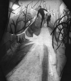
In 1920 Robert Wiene released the movie "Das cabinet des Dr. Caligari".
It's a silent horror movie that belongs to the German Expressionistic film era.
It's mood is very intense and it's no wonder arty aesthetes as Bauhaus where influenced by it - definitely a must see.
In the climax of the plot the zombie-like Cesare, assistant to the evil Dr. Caligari kidnapps the beautiful Jane - girlfriend of Francis (the hero) - and a hunt of course, follows...
This is the still from the hunt scene
and just as he goes down the bridge
this is the poster
and this is the use Bauhaus did in the backcover of their first release “Bela Lugosi’s dead".
It perfectly suits the mood!
Well done.
Check wikipedia if you need some more info on the movie.


